![]() ----------- Your trusted
source for independent sensor data- Photons to Photos------------------------ Last revised:
2021-03-26
----------- Your trusted
source for independent sensor data- Photons to Photos------------------------ Last revised:
2021-03-26
Previous Article----------------------------------- Table of Contents------------------------------------ Next
Article
---- Sensor Analysis Primer - An Introduction to Energy Spectra for Sensor Analysis
--------------------------------------------------------- By Bill Claff
Introduction
In an earlier article we learned that a 2-dimensional
Fourier Transform (2D FT) can be used to visualize how uniform an image is.
But while 2D FTs are good visualization they don't give us much detail on the
reasons for non-uniformities.
We can take an FT and then perform a frequency analysis that will give us more
information.
This article will give us an introduction to these Energy Spectra and how they
can be interpreted.
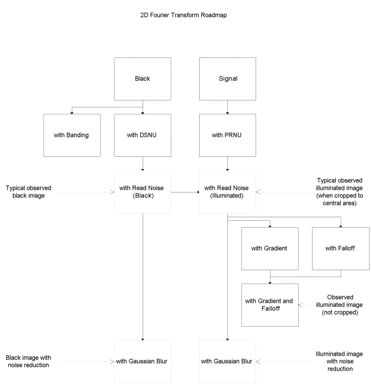
Roadmap
In this article I'll start by following the same roadmap as
for the 2D FTs.
I am going to present a number of synthetically generated images that represent
our understanding of what we ought to observe.
In each case the image will be presented on the left, the 2D FT for that image
on the right, and the Energy Spectrum for that image below.
The left-hand images are linked to PGM files so you can play with them yourself.
(You will want to use Save link as ... rather than Save image as ... to get the
PGM otherwise you'll get a JPG.)
The style of PGM file provided can be opened in ImageJ as well as any text
editor or even Excel.
Each Energy Spectrum is linked to an interactive chart where is can be examined
more closely.
Here's a diagram of the roadmap I will follow:
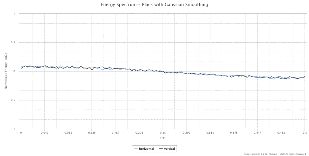
Black
For a hypothetic perfect sensor a black frame one the left
the corresponding 2D FT and Energy Spectrum look like:


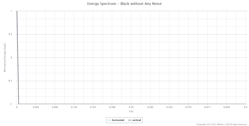
Not too exciting nor realistic but an opportunity to explain what we see in an
Energy Spectrum.
The x-axis is labeled f/fs and is the frequency normalized
to the sampling frequency. Because there is no useful information beyond the
Nyquist frequency the x-axis runs from 0 to 1/2.
Remember, frequency and wavelength have a reciprocal relationship. So the
x-axis runs from a wavelength of 2 on the right-hand-side to infinity at f/fs
of 0.
The y-axis is Normalized Energy expressed as log2. This
normalization may differ from similar charts you may have seen elsewhere.
The y-axis values of -1, 0, and 1 represent minimum possible, average, and
maximum possible energy respectfully.
In this first case out featureless uniform frame is entirely comprised of infinite wavelengths.
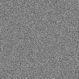
Now let's add some randomly placed Dark Signal
Non-Uniformity (DSNU):

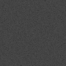
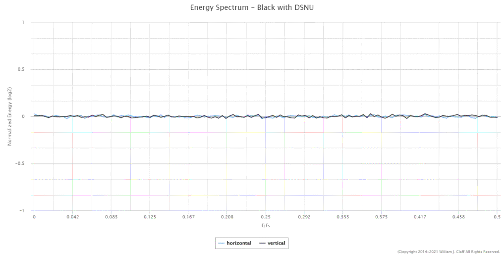
DSNU arises from the fact that not every pixel starts at exactly the same zero
and is a form of Fixed Pattern Noise (FPN).
This frame is random enough that there are equal amounts of
all frequencies from 0 to 1/2.
The squiggly lines are simply due to our relatively small sample size.
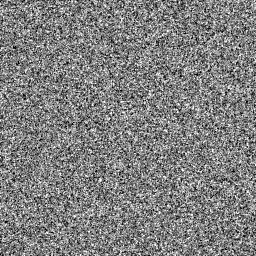
Now we add read noise:

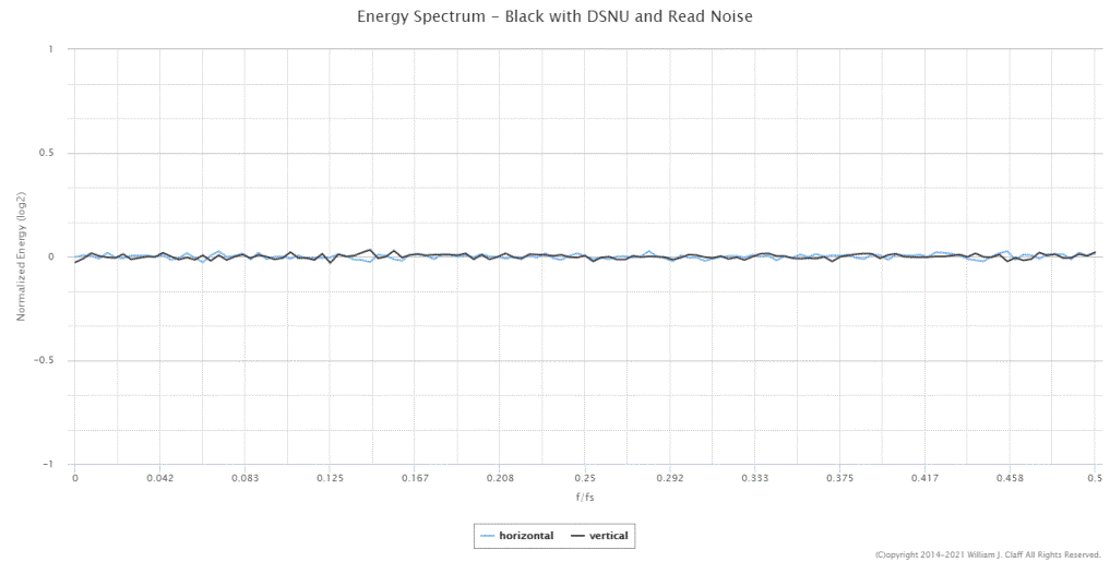
Read noise arises principally from the electronics used to read the value of
the pixel (hence the name).
This represents what we might reasonably expect to see from a well behaved
sensor.
(Although non-DSNU FPN is not unusual and often presents as horizontal or
vertical streaks.)
Also, on some sensors, on chip Phase Detect Auto Focus
(PDAF) may form a visible pattern.
And imbalance in multi-channel readout can also show temporal or fixed
patterns.
This is an important topic that we will cover in depth in a separate article.
Noise Reduction
We are not expecting to see noise reduction in our raw
image; but it happens.
Noise reduction, hot pixel suppression, and other signal processing share the
same general characteristic.
They all re-compute a pixel value based on neighboring pixels.
So to simulate this effect I added a small Gaussian Blur to
the typical black image:
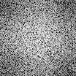
I boosted the contrast on the 2D FT to make the effect more obvious. The round
"sphere-like" effect on the 2D FT is an important feature to
remember.
And the drop in energy from left to right is also a key
characteristic of this process which is in the class of low-pass filters.
Low-pass filters allow low frequencies to pass at the expense of higher
frequencies which is why the curve drops off.
We can judge the strength of the filtering by the size of the drop; in this
case about 1/6 on our normalized scale.
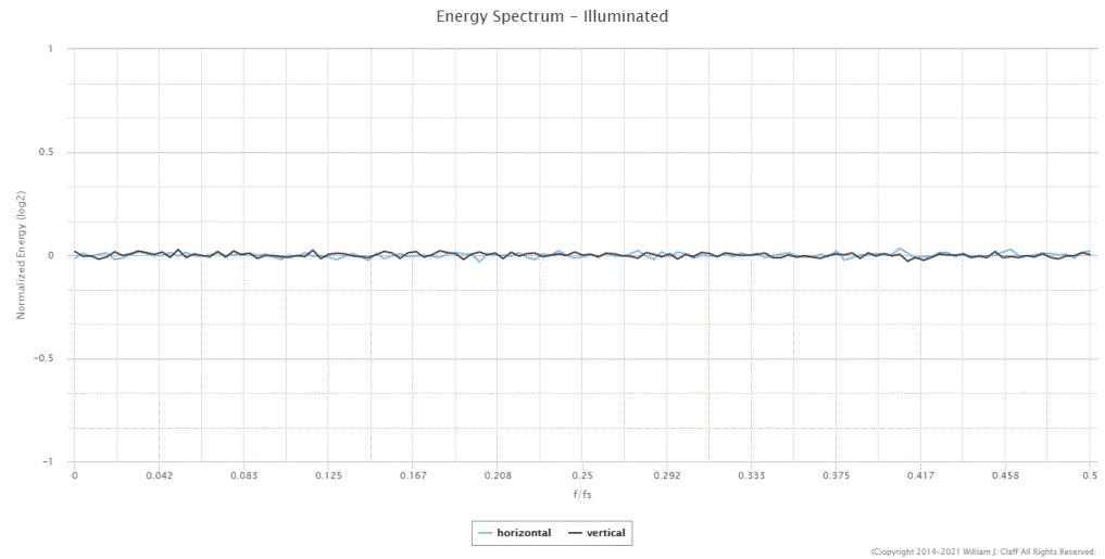
Signal
Black images are interesting and have the advantage that
they are typically evenly illuminated; .but I also frequently analyze evenly
illuminated images.
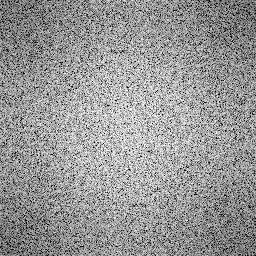
So here's what Signal alone would look like:
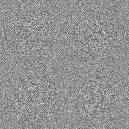

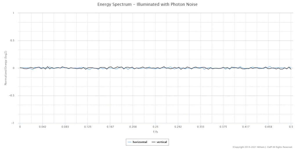
Since this is just a signal and it's associated Photon Noise it's not too
exciting. Frequency-wise it's indistinguishable from a black frame.
Now let's add some randomly placed Photo-Response
Non-Uniformity (PRNU):

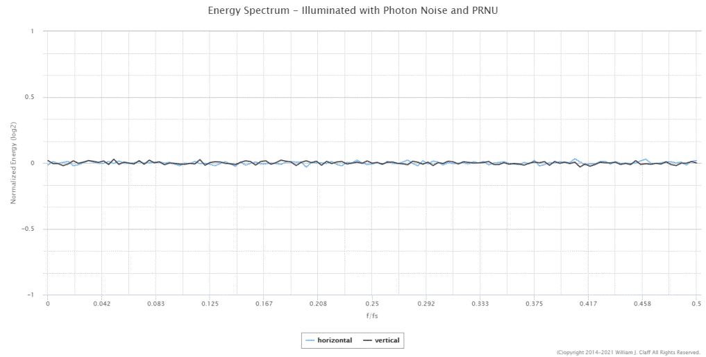
PRNU is another form of FPN. Again, this results is still pretty uninteresting
as there are no patterns to show up.
To get something representative of what we can observe,
let's add in the DSNU and read noise:

Still not very exciting; but this is what we would expect from a well behaved
sensor.
Noise Reduction Revisited
Here's what happens if we apply a Gaussian blur to the
signal image:
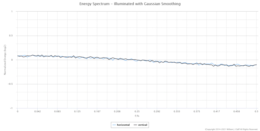
Once again the tell-tail circle on the 2D FT signals that some sort of nearest
neighbor signal processing has occurred.
And the Energy Spectrum tell us it's some sort of low-pass filter.
Gradients and Falloff
The manufacturing process can result in a small gradient on
the sensor. We can also get a gradient if our illuminated image collection is
imperfect.
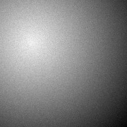
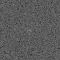
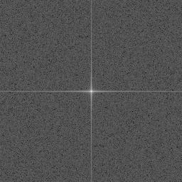
Here's what the signal image with a gradient looks like:
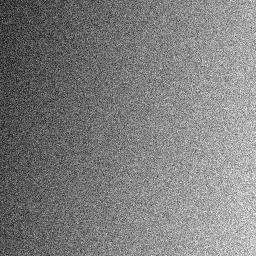
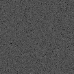
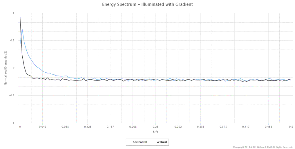
Well, that's something new.
This cross pattern happens when the left/right or top/bottom edges of the image
don't match.
Note the horizontal gradient is stronger than the vertical; and the cross is
wider than it is high.
The Energy Spectrum is also affected. The gradient destroyed any useful
information but an Energy Spectrum like this confirm it is present.
A more common problem with image collection is light falloff
(vignetting).
Applied to the signal image it looks like:
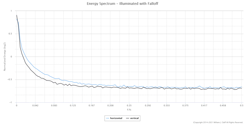
This has the same cross effect as the gradient and also a small white center
due to the falloff.
And the same adverse effect on the Energy Spectrum.
For completeness, let's combine them both:

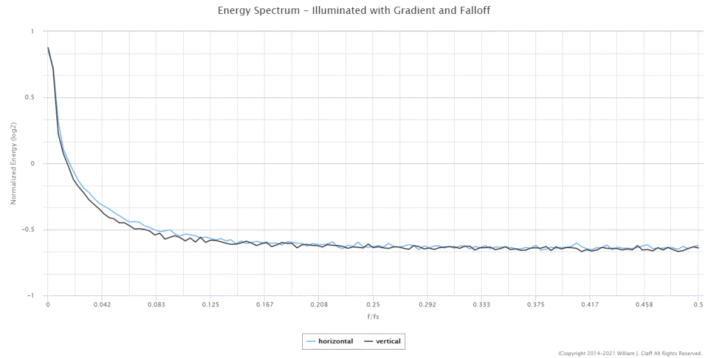
Note that I made the falloff particularly dramatic to better illustrate the
effect.
The Energy Spectrum is also not helpful except perhaps to identify that a
strong gradient and/or falloff is present.
Banding
The electronics used to read out the value of the pixels can
sometimes have a vertical or horizontal pattern.
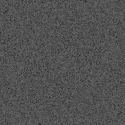
Here I have rearranged the DSNU data from above into vertical bands:


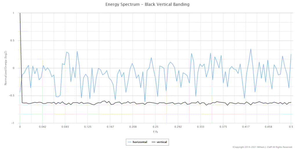
The strong vertical bands present as a horizontal line of the 2D FT.
The horizontal component of the Energy Spectrum shows large amounts of
relatively even energy at many frequencies.
We will see in the next article that more organized bands or patterns will
produce a more organized Energy Spectrum.
In particular this will be helpful in identifying whether and how PDAF pixels
are contributing to FPN.
Note that this banding image has exactly the same
statistical characteristics as the previous DSNU image shown here for
comparison:

So statistically we can't distinguish banding from DSNU; but both the 2D FT and
the Energy Spectrum can.
Banding acts like spatially correlated DSNU even though the origin is the
external electronics and not the pixel.
When the pattern of banding remains constant from frame to frame then it is
Fixed Pattern Noise (FPN).
Conclusion
We have seen a number of synthetically generated images and
their corresponding 2D FTs and Energy Spectra.
Now we have a good idea of how to interpret patterns in a 2D FT and Energy
Spectra.
We know that a uniform FT with a white center is ideal and
that the Energy Spectrum will be roughly uniform near zero..
We know that a cross is probably the result of a gradient, falloff, or banding.
These Energy Spectra show a strong decay.
We know that a slightly enlarged white center is probably from a strong
falloff. These Energy Spectra also show a strong decay.
And we know that a large circular pattern is the signature of signal processing
such as noise reduction.
When signal processing is present the Energy Spectrum has help us identify
low-pass (and high-pass) effects as will as to gauge their strength.
Energy Spectra are a valuable tool to utilize particularly
when we have a 2D FT that shows any non-uniformity.
In a separate article, Energy
Spectra and Repeating Patterns, I'll cover how Energy Spectra can help us
to understand how repeating patterns such as PDAF pixels can contribute to FPN.